When you’re designing a label, your font choice can be a make-or-break decision. Selecting the perfect font can tie the design together, sending just the right message and harmonising with the look and feel of your brand. Choosing the wrong font, on the other hand, can undermine the core message of your label and create a negative perception of your brand or product.
Couple the importance of font choice to the abundance of different options available, and it’s easy to see why this is a decision that leaves many scratching their heads. With thousands upon thousands of fonts out there to choose from, homing in on the right one can be pretty tough.
That’s why we’ve decided to offer a few helpful tips to put you on the right track. Below, we’ll put our label design expertise to good use by running through each of the key considerations you should bear in mind when you’re choosing a font for your label. From your brand values to the purpose and intent of your label and industry conventions, we’ll cover everything you need to know in order to find the perfect font.
Make sure it’s consistent with your brand
To kick things off, let’s remember the importance of branding and consistency. When you’re choosing your font - especially if it’s for a product label - make sure it works with your existing branding and tallies with your brand values. Are you a fun, quirky brand, or are you more serious and focused? Are you targeting a younger or older audience? Understanding your audience (and what your brand stands for) will help you work out which font is most appropriate.
Do you need to use more than one font?
Here’s another vital consideration: will your label need to utilise more than one font? Often, using multiple fonts is a necessity. Imagine if food labels used the same font throughout - it wouldn’t work. The font you use to list ingredients and allergen information should, in most cases, be different from the one you use to showcase your brand values or your product’s USPs. So, if you’re creating a label that uses more than one font, make sure that the fonts you choose work well together.
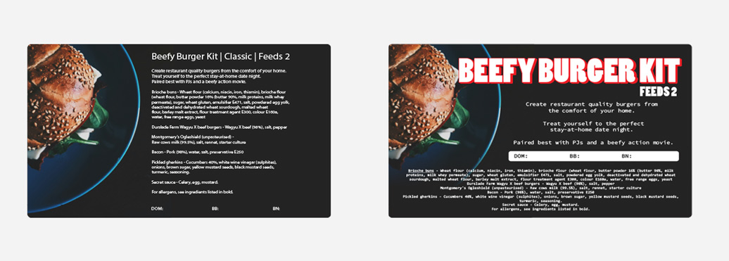
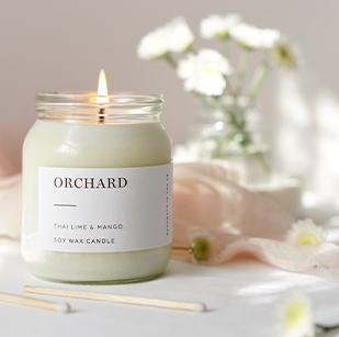
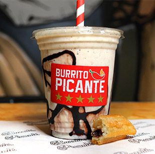
Image for illustration purposes only.
Determine your goals and priorities
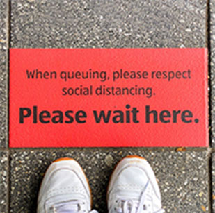
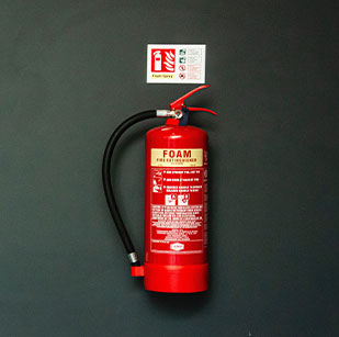
Every label or sign is created to serve a specific purpose, whether it’s to promote a product, make employees aware of safety rules and regulations or point visitors in the right direction. Before you start picking out a font, make sure you clearly define the purpose of your label - and bear this in mind when you’re choosing which font to go for.
If readability is your top priority, you’ll probably want to opt for a clean, simple and minimalist sans-serif font. If you’re looking to showcase your brand and tap into customers’ emotions to help sell a product, a more standout font choice could make all the difference.
Consider how the font makes you feel
This links directly into the point we just made about emotions. Whether we realise it or not, fonts can elicit specific emotions much in the same way colours can - so it’s important to remember this when you’re choosing a typeface. It’s an extreme example, admittedly, but you wouldn’t design a safety label using a font like Jokerman… nobody would take the content of the label seriously!

Image for illustration purposes only.
Do you need to use any special characters?
Depending on the requirements of your label design, you might need to use special characters or symbols - and not every font has been built with these characters in mind. When you’re testing fonts, make sure you consider this to avoid having to make any last-minute alterations to your design.
Avoid clichés
The font world is full of clichés. We mentioned Jokerman earlier, but there are plenty of different examples of fonts that can be used too literally. Writing a humorous sentence in a daft-looking font won’t make it any funnier - it will just devalue the overall design and undermine the message you’re trying to get across.
Get inspiration from your competitors
As Mark Twain once said, “There is no such thing as a new idea. It is impossible. We simply take a lot of old ideas and put them into a sort of mental kaleidoscope.” He had a point. We’re constantly being inspired by the world around us, so coming up with a truly original idea simply isn’t possible. Don’t be afraid to study your competitors and take inspiration from them when you’re choosing a font, because they will have done the same.
Ask for opinions
That leads us nicely onto our final point: ask for people’s opinions. If you can’t decide which font to go for, create two different label designs and ask a select group of customers which one they prefer. There’s no better way to make sure you’re on the right track than to ask your target audience!
Speak to the experts at Flexi Labels today
We hope the tips above prove helpful on your quest to find the perfect font for your label. If you need a helping hand, or are looking for a trusted supplier to produce your labels to a high standard, the team at Flexi Labels is ready and waiting to assist.
With decades of experience across our team, more than 20,000 happy customers across the UK and Europe and in-house designers, Flexi Labels is the place to come for all your label design and manufacturing needs. Want to learn more about us and what we do? Check out our FAQs page or get in touch with us today.


