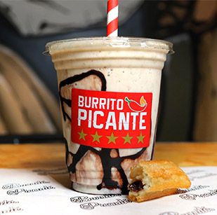
The colours within our environment have been proven to have a significant effect on our behaviour. We all react differently to colours either consciously or subconsciously. Company branding, product packaging, logos and labels are often designed with a focus on the selection of colour to trigger a certain response with their intended audience. Colour in a marketing context can be a very powerful tool but it has to be carefully considered as it can polarise opinions and can have a detrimental effect on people's approach to the related brand or company. The subject of colour and human behaviour is constantly being evaluated. Extensive studies show that the same colour can lead to very different feelings depending on the viewer's origins, location in the world, culture and religious beliefs. There are some universally accepted feelings and approaches to colours, here are a few examples:
Red - Love, Lust, Excitement, Negativity
Blue - Corporate, High Quality, Competence, Masculine
Green - Good Taste, Friendly, Envy
Pink - Sophistication, Feminine, Sincerity
Black - Expensive, Sophistication, Fear, Grief
Purple - Power, Authority, Sophistication
As you can see, there are some very contradictory feelings for the same colour. When designing a company logo or a label for product packaging, the feelings toward certain colours must be taken into consideration. Company logos can convey meaning simply through the use of certain colours. If you can influence your target audience to react positively towards your brand, it gives you a great opportunity to then provide your product or services to them. So when you're working on your next project, stop to consider the power of colour and how you can use it to your advantage.


